DEV BLOG / 07
Moving into Godot
Putting the planned player-to-roster-to-game route into the Godot prototype.
Game screenshots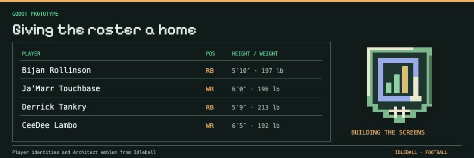
In the last update, I had narrowed the first prototype down to a player profile, a roster and a game view. Around September, I started putting that into Godot.
Having a programming background helped with the data. It didn’t automatically teach me how to build a screen someone else could use. I had to learn that part while doing it, and the first attempts gave me plenty to reconsider.
I wanted the roster to be about as easy to read as a good bourbon menu. An ambitious standard for a man who had spent months arguing with his own player data.
What changed since the last post
- The prototype work moved into Godot. The engine experiments now had somewhere to become screens and controls.
- I started bringing player information into a profile view. Names, positions and identity details had to work as something you could read, rather than just fields I understood in the editor.
- I began putting the team together on a roster screen. That made the difference between “the data exists” and “I can use this to choose a lineup” much harder to ignore.
- Navigation became part of the work. I needed a sensible route between a player, the team and the game, including a way back.
- The simulated game needed a view of its own. Following a matchup was a different task from managing the roster.
- I had something to use outside the editor. The first screens gave the next round of roster and game-view work a place to start.
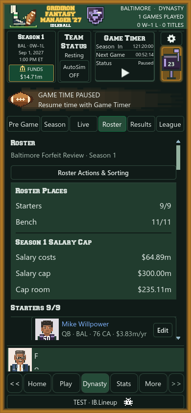
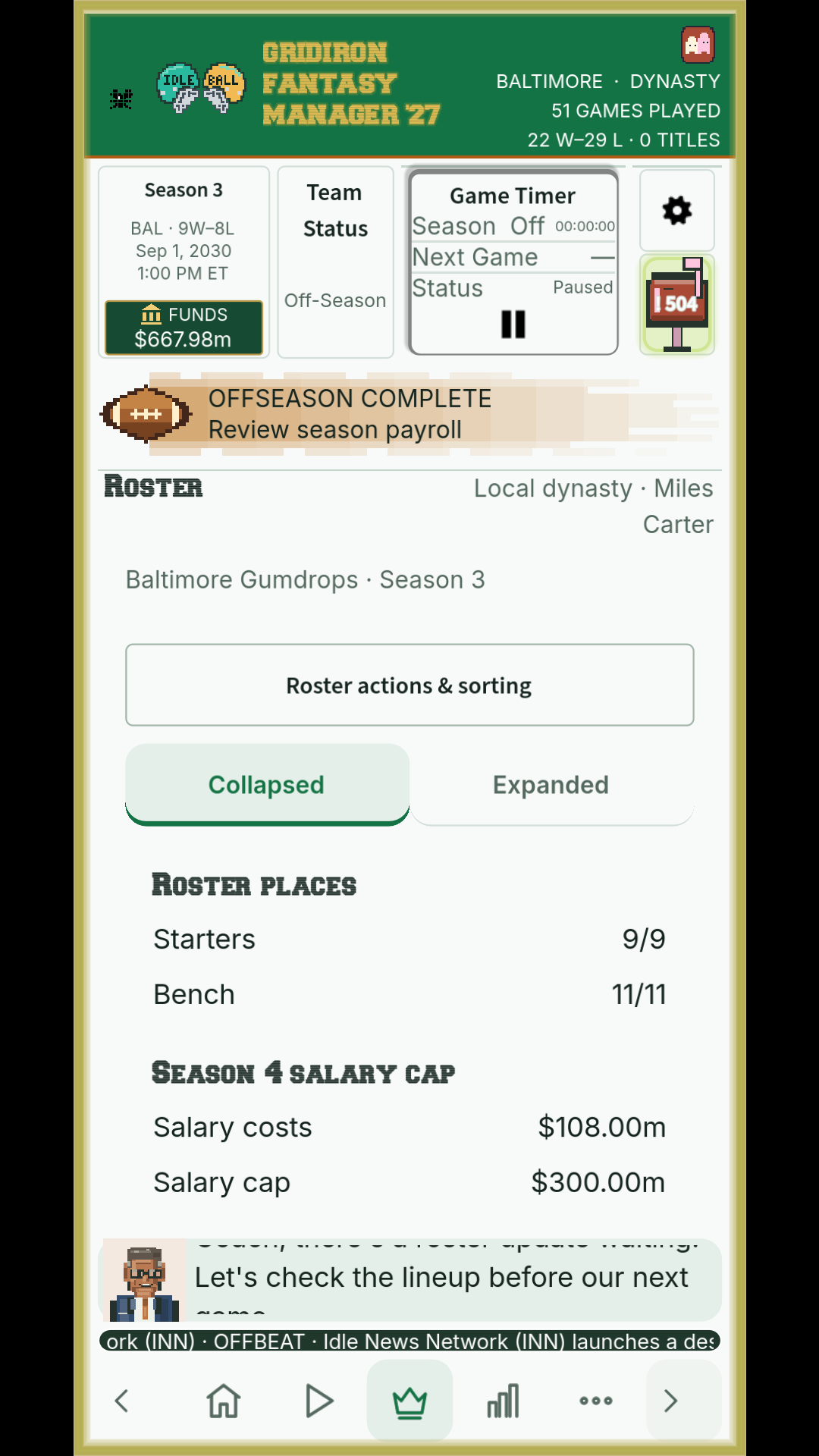
The roster, then and now
Different development saves, with the older layout alongside a recent capture.
It was finally on screen
That was a big change for me. For most of the year, I had been working on parts that were difficult to show someone without a long explanation. Now there was something I could point at and try to use.
It was still rough. A profile could contain the right information and be awkward to read. A route through the screens could make perfect sense to me because I already knew where everything was. Neither of those was a particularly good excuse to leave it that way.
The year of engine work meant I wasn’t starting with empty screens, which helped. It also meant the prototype inherited some choices I probably would have made differently if I’d understood the interface work sooner.
A season with somewhere to live
Two more views from the playable prototype.
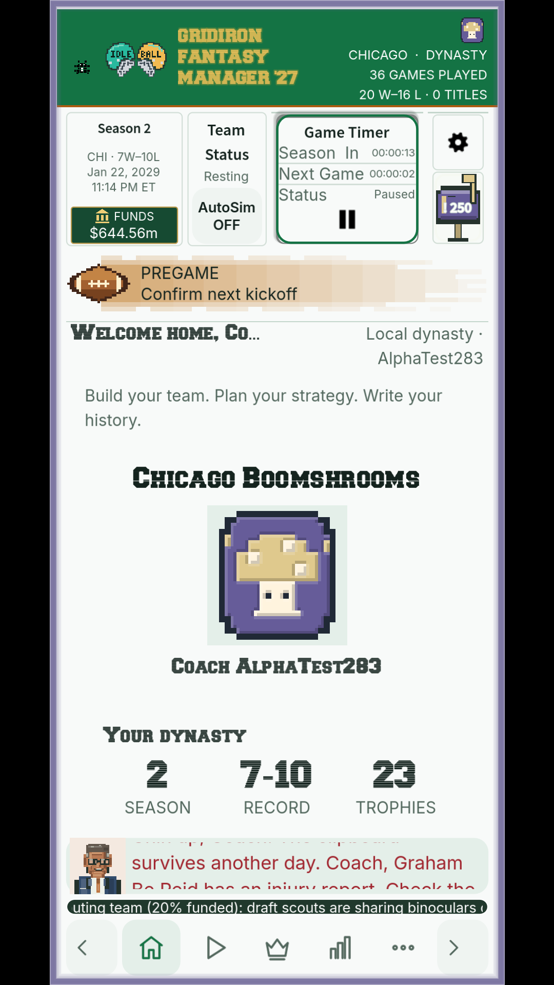
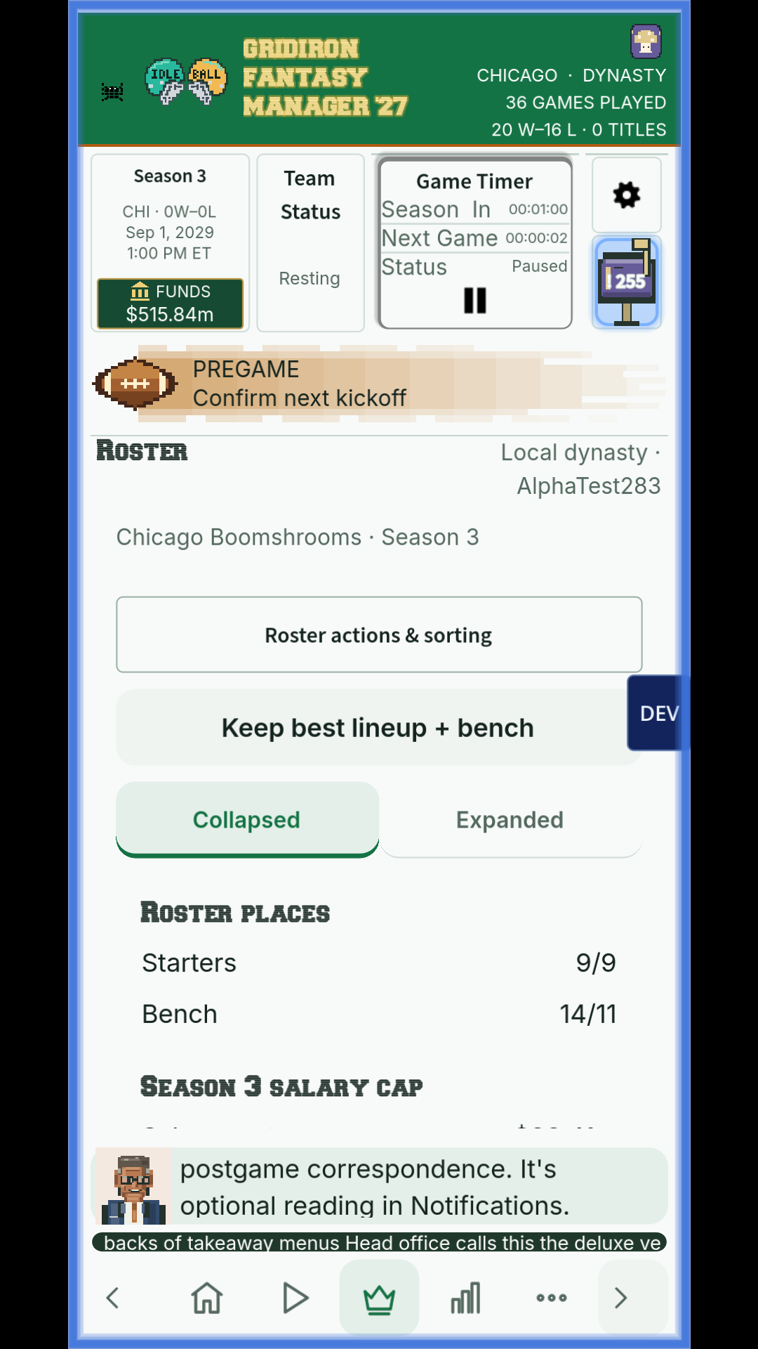
Next came a milestone I had been working toward for a long time: getting through the first full season. Getting something on screen was the first step. Seeing the season reach its end was another matter entirely.