
DEV BLOG / 21
Blinking portraits and a more intuitive interface
A tiny animation, a wider menu overhaul and a lot of attention to the ordinary controls.
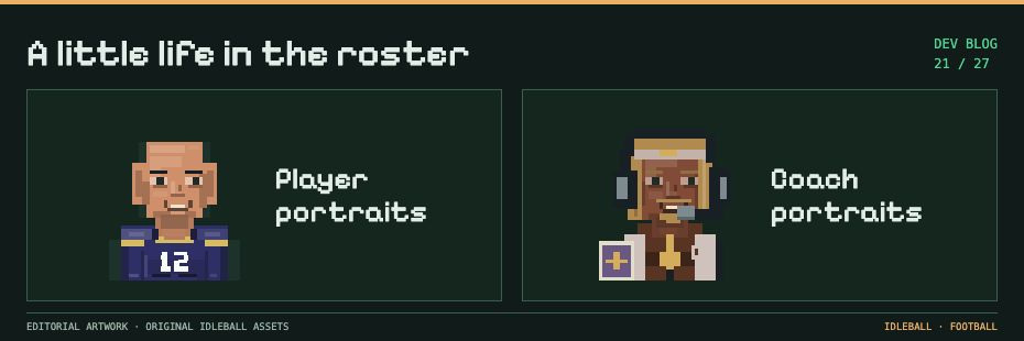
The players have faces, expressions and aging. Now they blink.
That’s a small addition, but I like what it does for a portrait. The player remains the same little pixel character; he just looks a bit less like he’s permanently alarmed by my budget decisions.
What changed since the private-league update
- Player portraits blink using their existing eye pixels. The blink lasts roughly 130 milliseconds on a 5.4-second cycle, staggered by identity.
- Only visible opted-in portraits need animation work. Redraws happen at transitions rather than continuously rebuilding every face in the league.
- Joe’s mouth animation remains separate. His speaking behavior survives the portrait changes.
- The interface shares more visual rules. Colours, spacing, cards, grids, shadows and Varsity headings are being brought together.
- Navigation has clearer categories and labels. Collapsing or pinned headers and progressive disclosure reduce the amount competing for attention.
- Return state is preserved. Selected players, filters and scroll positions should survive the route into a detail view and back.
- Gestures have visible alternatives. Portrait inspection, long press and horizontal navigation don’t require the player to guess a hidden action.
- Supported devices have successful-action haptics. They accompany the result instead of substituting for it.
- Numbers can reveal their real values. Presentation animations finish at the saved amount and can be cancelled when the view becomes stale.
- The Report Bug control moves into the green top bar. The gold title and the report action both need room to remain legible.
Animation shouldn’t become another problem
A blink should leave the eye placement and player identity alone. Numerical motion should leave money, statistics and timers alone. The decoration can make the screen easier to read without changing the football underneath it.
Those are the animation settings in the code. I still need to see how they look on the actual devices and layouts people will use.
The menu still has to make sense
This wider overhaul includes floating navigation, a finance pop-out, a compact Inbox and separate player contract, career and statistics cards. Stable franchise IDs and player links need to survive the rearrangement too.
I’m trying to make the screen explain itself. It’s very easy to become fluent in a menu you built and forget how strange it looks to everyone else.
The online notification relay still needs deployment work. I can’t call delivery reliable until I’ve seen the notices reach the actual devices and open the right screen.
The local side now keeps a post-save notice queue, delivery receipts and acknowledgments. Opt-in, tapping back into the right screen and handing ownership between foreground and background all need to work together. Those details are less visible than a blink, but rather more important if the game is trying to tell me about a decision.
Next week I’m looking at long careers, saved history and the computer clubs that can hold up the next draft.